In my previous post, I described how to make a nice knob / dial using the SEGGER AppWizard. This time it’s all about creating some cool buttons.
The AppWizard Button Widget
The AppWizard, SEGGER’s new, still-under-development GUI builder tool, offers a variety of widgets. One of the is the Button widget. It allows adding a button to a screen and assign three different bitmaps to it:
- Unpressed state
- Pressed state
- Disabled state
You can also put text on the button, set a background color, and set the bitmap alignment. In addition, you can choose whether or not this is meant to be a regular button (going from unpressed to pressed back to unpressed on a single click / touch) or behave more like a toggle switch (change between the pressed / unpressed states on a single click / touch).
Creating a visually appealing button
Like last time, it all starts with finding nice graphics on your favorite stock image site. I wanted to find an image that has a nice buttons in two states: pressed and unpressed.
I thought these looked pretty neat:
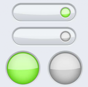
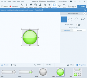
I imported the file into my trusted SnagIt editor. Now the goal was to split the image into 4 individual images and crop them in such a way that the pressed and unpressed buttons line up perfectly and have the exact same pixel size.
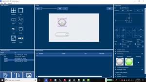
Then I created a new project in AppWizard and added a screen and a white box as the background. I then added the first (round) button using the Button widget and sized it exactly like the bitmaps. I added the pressed and unpressed images and set the button to toggle mode. The same procedure for the second button, and we have this:
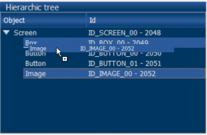
The background of the buttons isn’t exactly white, so you can see the outlines a little bit which is not desirable. I went back to SnagIt to make a rectangle with the exact background color of the buttons and used that as my background image in the AppWizard. When you bring in the new image, it initially covers the buttons, but you can drag-and-drop the image to a position behind the buttons using the Hierarchic Tree window.
Now the buttons blend nicely into the background.
Invoking the test mode in the AppWizard brings the buttons to life:
Now how about a nice on/off button. I found this one:

I followed the same procedure as before and added the button to the existing AppWizard project. Here’s the result:
Pretty nice!
I found another cool push-button style button and created a new project for it:
Making something happen when the button is pushed
Okay, pushing buttons is nice, but ideally something is happening when you push a button.
I made another project with an on/off button and two images of a light bulb. The first image has the light bulb lit, the second image has it off.
I aligned the images such that one was perfectly covering the other, with the second image (light bulb off) on top.
Then I used the Interactions window to add the following interaction:
In plain English: “Whenever the toggle switch gets released (after being clicked), toggle the visibility of the image on top.”
This creates the following neat effect:
Running it on the target
Now let’s export the files in AppWizard into a SEGGER Embedded Studio project, build it, and run it on the target (e.g. the STM32F746G-Disco board).
I switched the graphics to a black background because it looks better on camera:
Not bad!
The next blog article will deal with the Slider widget.
Stay tuned…