Recently, we at SEGGER released AppWizard, our new GUI design tool for our emWin embedded graphics library. It is now available as part of the emWin PRO package (v6.10 and later).
The initial version of AppWizard contains a variety of objects and widgets, such as sliders, rotaries, images, switches, buttons, and more. Getting started with designing a GUI with emWin is now even easier!
At first glance, though, a common type of widget seems to be missing: A gauge widget. Gauges are a common way to display information such as temperature, pressure, voltage, speed, rpms, etc. to the user in a graphical way.
So, what is a GUI designer to do?
Creating a circular gauge in AppWizard using the Rotary widget
It turns out that a very common type of gauge – the circular gauge – is quite similar to a rotary object, with the following two differences:
- A rotary object receives inputs from the user, while a gauge outputs data to the user.
- The optical appearance of a rotary object is quite different from a gauge.
In this article we will take a look at how AppWizard’s flexibility lets us re-purpose the rotary widget as a circular gauge.
The look
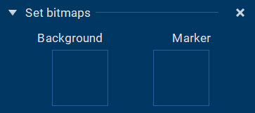
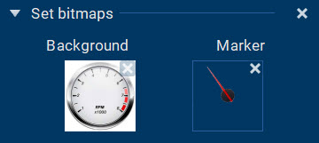
Let’s start with the optical appearance. Thanks to AppWizard’s bitmap-driven design, making the rotary widget look like a circular gauge is pretty easy. After adding a rotary widget to your AppWizard project, we have to take care of two bitmaps: the background, and the marker.
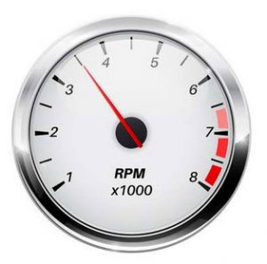
For the background, instead of the image of a knob or a dial, we simply use an image of the gauge we want to display on the screen. Remember, it has to be a round gauge. (We will see how to do linear gauges in the second part of this article.)
I found the following gauge on 123rf.com, where we have a subscription. Of course you can use any other stock photo provider or create your own in your favorite graphics software.
Separating the background from the marker
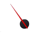
Our first task is to separate the background from the marker. If you have an image that is composed in multiple layers, that’s pretty easy. If not, you need to do some image editing. When you’re done, you end up with two separate images, one for the background, and one for the marker:
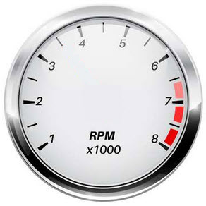
For the background image, it is important that the gauge is centered and the image is square (same number of pixels for both width and height).
For the marker image, it is critical that it has a transparent background. The PNG image format is great for this. It also needs to be square – and the point around which you want your marker to rotate needs to be in the exact center of the image. Otherwise your marker will wobble later on and it won’t look good.
Adding the bitmaps to AppWizard
Now that we have our images for the background and the marker, we can add them to our AppWizard project (notice the transparent background for the marker):
The AppWizard editor now looks like this:
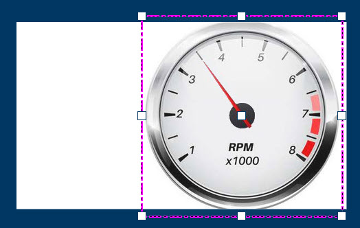
Looks like a gauge…now we need it to behave like one, too.
Adding behavior
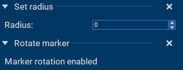
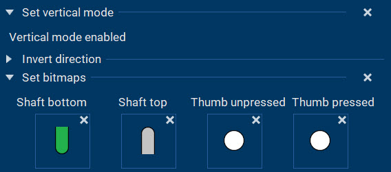
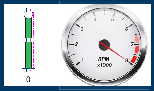
In order for the marker to spin, we need to set the marker radius to 0. We also need to enable the marker rotation.
Now, when we enter the AppWizard play mode, we can spin the marker freely across the gauge. However, we want to control the marker from within the application, not via external touch input. This is where AppWizard’s Interactions come into play.
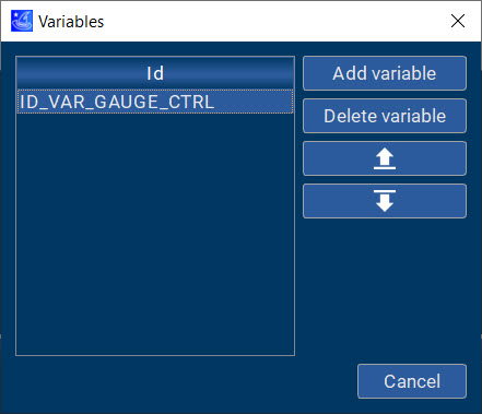
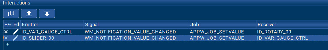
The first step is to define a variable that will hold the value to be sent to our gauge.
Next, let’s add an interaction that sends the value of this variable to the gauge every time that value changes:
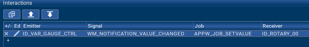
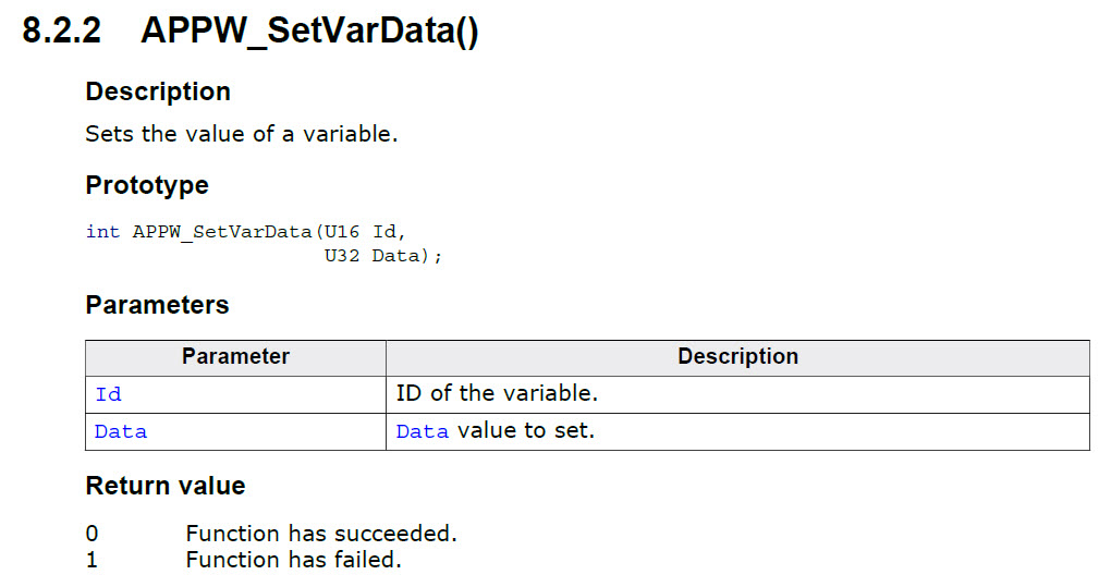
After that, we can use the following AppWizard API call to manipulate variable ID_VAR_GAUGE_CTRL from within the non-GUI portion of our application (see AppWizard User Manual):
So our application will calculate the appropriate data value for the gauge, pass it to the variable ID_VAR_GAUGE_CTRL via the API call above, and the interaction we created will pass it to the gauge.
Simulating the data driving the gauge
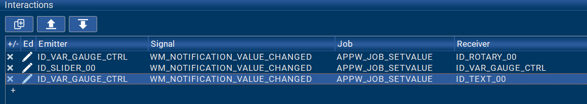
In order to try this out without an actual project running on hardware, we can simply use a slider object to simulate the data coming from our application.
With another interaction, we can load our gauge variable with the value of the slider:
Now the gauge marker is moving when we move the slider in play mode. In order to find the appropriate range of data values, we can tweak the range parameter of the slider and the offset parameter of the rotary. We can then use a text object in decimal mode and a third interaction to also display the data values on the screen (just for testing purposes).
The result
The complete simulation now looks and feels like this:
Notice that the data value ‘0’ is equivalent to the maximum value on the gauge (i.e. revving this virtual engine to the limit), whereas the data value ‘2750’ means ‘0 RPMs’. This is because each increment in the data value is the equivalent of 1/10 of a degree of the angle of rotation of the gauge marker, and in mathematics, a clockwise rotation is considered a negative rotation. In your application code, you can manipulate the raw data such that it scales correctly when it is passed to the gauge.
Summary and Outlook
There you have it. Even though AppWizard currently doesn’t have a gauge widget per se, AppWizard’s flexibility lets us re-purpose the rotary widget as a pretty nice circular gauge.
If you have access to AppWizard and you would like to try the example above, feel free to download it from here:
In Part II of this blog article, we’ll take a look at how to create nice linear gauges using the slider widget.
Stay tuned!